
Tillys Test Project – Digital & Retail Design Exploration
This project was a creative exploration undertaken as part of a test assignment for Tillys, a leading youth-focused lifestyle retailer. The objective was to demonstrate my design capabilities across various digital and in-store marketing assets, aligning with Tillys' energetic and trend-conscious brand identity.
Project Scope:
Digital Assets: Designed engaging website banners, social media posts, and email newsletters that reflect Tillys' vibrant aesthetic and appeal to their target demographic.
In-Store Displays: Developed compelling point-of-purchase (POP) posters and billboard concepts to enhance the in-store experience and drive customer engagement.
Concept Development: Utilized the Apple iPad and Apple Pencil to create hand-drawn sketches, facilitating rapid ideation and iteration of design concepts.
Project Timeline: (7) days from receipt of email and all marketing design assets.
This comprehensive approach allowed me to showcase a cohesive visual narrative that resonates with Tillys' brand ethos, demonstrating versatility in both digital and physical retail environments.

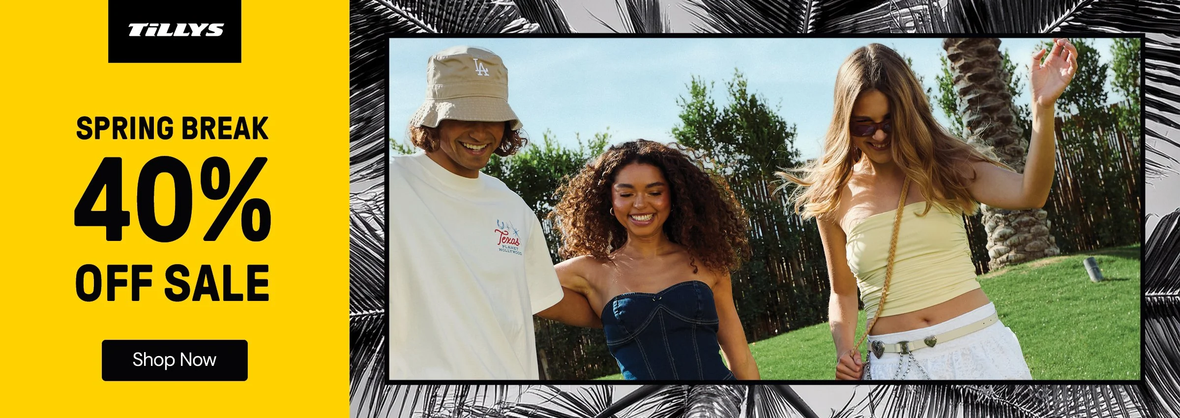


Tillys Website Banner Design Process
As a designer, my goal was to create visually compelling graphics that resonate with the brand's youthful and trend-conscious audience. My process encompassed the following steps:
Understanding the Brand and Audience: I began by immersing myself in Tillys' brand identity, ensuring that each design aligned with their aesthetic and appealed to their target demographic of teenagers and young adults.
Concept Development: Traditionally I would collaborate with the marketing team to develope concepts that highlight seasonal promotions, new arrivals, and exclusive collaborations. This usually involves brainstorming sessions to generate fresh new ideas that would capture attention and drive engagement.
Visual Design: Utilizing tools like Adobe InDesign and Illustrator, I crafted banner designs that featured bold typography, high-quality imagery, and dynamic layouts. I ensured that each banner maintained consistency with Tillys' overall visual language while standing out on the website.
Responsive Design Considerations: Recognizing the importance of mobile browsing, I optimized banners for various screen sizes, ensuring they were visually effective on desktops, tablets, and smartphones.
This structured approach allowed me to produce banners that not only enhanced Tillys' online presence but also contributed to a cohesive and engaging user experience.
Tillys Social Media Design Process
As a designer for Tillys' social media content, I would focus on creating visually engaging posts and stories that resonated with the brand's youthful and trend-conscious audience. My process included:
Brand Alignment: Ensuring each design reflected Tillys' aesthetic and appealed to their target demographic of teenagers and young adults.
Concept Development: Traditionally I would collaborate with the design and marketing team to brainstorm new ideas that highlight seasonal promotions, new arrivals, and exclusive collaborations.
Visual Design: Utilizing tools like Adobe InDesign, Adobe Photoshop, Adobe Illustrator and Figma to craft bold typography, high-quality imagery, and dynamic layouts, maintaining consistency with Tillys' visual language.
Platform Optimization: Tailoring designs to fit the specifications and best practices of various social media platforms, ensuring optimal display and engagement.
This structured approach allowed me to produce social media content that not only enhanced Tillys' online presence but also contributed to a cohesive and engaging brand experience.
Tillys In-Store POP Poster Design Process
Designing Point-of-Purchase (POP) posters for Tillys involved a strategic approach to capture the attention of in-store shoppers and drive engagement with featured products. My design process included the following steps:
Understanding the Campaign Objectives: Traditionally I would collaborate with the marketing team to comprehend the goals of each campaign, whether it was to promote a seasonal sale, a new product launch, or a brand collaboration.
Audience and Brand Alignment: Ensured that the design resonated with Tillys' target demographic—youthful, fashion-forward customers—while maintaining consistency with the brand's visual identity.
Concept Development: Developed concepts that combined bold typography, compelling imagery, and clear messaging to create eye-catching designs that stood out in the retail environment.
Design Execution: Utilized design tools to create high-resolution posters, paying close attention to color schemes, layout balance, and visual hierarchy to guide the customer's eye effectively.
Material and Print Considerations: Will work with the production team to select appropriate materials and finishes that enhanced the visual appeal and durability of the posters in various store settings.
This comprehensive approach ensured that each POP poster effectively communicated the intended message, attracted customer attention, and contributed to the overall success of Tillys' in-store marketing efforts.
Tillys Billboard Design Process
Designing billboards for Tillys involved creating impactful visuals that captured the brand's energetic and youthful spirit. My process included:
Understanding Campaign Objectives: Traditionally I would collaborate with the marketing team to grasp the goals of each campaign, ensuring the billboard aligned with Tillys' brand identity and resonated with the target audience.
Concept Development: Brainstormed creative concepts that highlighted key messages, promotions, or brand values, focusing on simplicity and clarity to ensure quick comprehension by viewers.
Visual Design: Crafted bold and engaging designs using high-contrast colors, large typography, and compelling imagery to capture attention and convey the message effectively.
Location Considerations: Took into account the specific locations where the billboards would be displayed, tailoring designs to suit the environment and maximize visibility.
This structured approach ensured that each billboard effectively communicated Tillys' message and enhanced brand visibility.
Tillys Email Newsletter Design Process
Designing email newsletters for Tillys involved creating visually engaging and brand-consistent communications that resonated with our youthful and trend-conscious audience. My design process included the following steps:
Understanding Campaign Objectives: Traditionally I would collaborate with the marketing team to comprehend the goals of each newsletter, whether promoting seasonal sales, new product launches, or exclusive collaborations.
Audience and Brand Alignment: Ensured that each design reflected Tillys' energetic and youthful brand identity, appealing to our target demographic of teenagers and young adults.
Concept Development: Developed concepts that combined compelling imagery, bold typography, and clear messaging to create eye-catching designs that stood out in crowded inboxes.
Visual Design: Utilized design tools to craft high-quality visuals, maintaining consistency with Tillys' overall aesthetic while ensuring readability and engagement.
Responsive Design Considerations: Recognized the importance of mobile browsing by optimizing newsletters for various screen sizes, ensuring they were visually effective on desktops, tablets, and smartphones.
This structured approach allowed me to produce email newsletters that not only enhanced Tillys' online presence but also contributed to a cohesive and engaging brand experience.
Tillys Hand Sketch Concept Design Process (iPad)
Integrating digital tools into my creative workflow, I utilized the Apple iPad and Apple Pencil to develop hand-drawn concept sketches for Tillys. This approach allowed for a seamless blend of traditional sketching techniques with modern technology, enhancing efficiency and precision.
1. Initial Conceptualization
I began by gathering inspiration aligned with Tillys' brand identity, focusing on themes that resonate with their youthful and trend-conscious audience. Mood boards and reference images were compiled to guide the creative direction.
2. Digital Sketching
Using applications like Procreate and Adobe Fresco, I created initial sketches directly on the iPad. These tools offered a variety of brushes and textures, simulating traditional media while providing the flexibility of digital editing. The Apple Pencil's sensitivity allowed for precise control over line weight and shading.
3. Iterative Refinement
The digital format facilitated easy adjustments and iterations. Layers were employed to separate elements, enabling efficient modifications without compromising the overall composition. This iterative process ensured that the final design met both aesthetic and functional requirements.
This method of using the iPad for hand-drawn concept development proved to be an effective fusion of artistry and technology, aligning with Tilly’s dynamic brand image and streamlining the design process.
Dear Kris & Rachael,
I wanted to express my sincere gratitude for the opportunity to work on the test project assets. It was a pleasure to contribute creatively and align with your vision for the brand. Your guidance and feedback were invaluable, and I truly appreciate the chance to demonstrate my design capabilities.
I hope to continue contributing to your team in a capacity that leverages my strengths in photography and social media. I'm enthusiastic about the possibility of a Graphic Design role or a similar position where I can further apply my skills to support and enhance the brand's visual storytelling.
Thank you once again for entrusting me with this project. I look forward to any future opportunities to collaborate.
Kind Regards,
CJ Smith
San Clemente, California
Email: surfsaltwater@gmail.com
Call/Text: (949) 449-4093